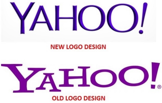
Yahoo’s New Logo Fails to Impress

Yahoo’s ’30 days of Change’ campaign came to an end last week on September 5th, and the company concluded by unveiling its final, new logo. Unfortunately, it failed.
The internet major began to show a new logo for itself every day on its website as part of its corporate re-branding strategy. However, the public doesn’t seem to have taken to it too kindly. The new logo was the subject of much criticism, with people accusing CEO Marissa Mayer of failing.
Skift CEO Rafat Ali – “I feel cheated and violated. Yahoo you made a mockery out of all of us.”
Entrepreneur Derek Powazek: “No logo has ever solved a business problem, but especially not this one.”
Yahoo CEO Marissa Mayer was personally involved in the designing of the new logo, worked with her team, including an intern in coming up with it. She described her team’s process of coming up with the new logo in the following way:
We knew we wanted a logo that reflected Yahoo – whimsical, yet sophisticated. Modern and fresh, with a nod to our history. Having a human touch, personal. Proud.
Other elements fell quickly into place:
We didn’t want to have any straight lines in the logo. Straight lines don’t exist in the human form and are extremely rare in nature, so the human touch in the logo is that all the lines and forms all have at least a slight curve.
We preferred letters that had thicker and thinner strokes – conveying the subjective and editorial nature of some of what we do.
Serifs were a big part of our old logo. It felt wrong to give them up altogether so we went for a sans serif font with “scallops” on the ends of the letters.
Our existing logo felt like the iconic Yahoo yodel. We wanted to preserve that and do something playful with the OO’s.
We wanted there to be a mathematical consistency to the logo, really pulling it together into one coherent mark.
We toyed with lowercase and sentence case letters. But, in the end, we felt the logo was most readable when it was all uppercase, especially on small screens.
So the exclamation mark (albeit with a tilt) and the yodel have stayed. While the logo bears a strong resemblance to the older logo, it is a change nevertheless.
[youtube https://www.youtube.com/watch?v=_0b6qaPY-CQ]
There’s an optimistic way to look at all this. While the logo may not have gone down too well with people, it definitely has generated a buzz about the company, bringing it back into focus among the crowd – something Mayer would be happy about.
What do you think of the new Yahoo logo? Let us know in the comments below.
